In the world of web design, grids play a vital role in creating aesthetically pleasing and functional layouts.
By providing a framework for organising content, grids enable designers to maintain consistency, achieve balance, and prioritise responsiveness. In this article, we will explore the importance of using grids in web design and discuss the golden rules for effectively implementing them.

Understanding the Importance of Grids in Web Design
Before diving into the golden rules, let’s first understand why grids are crucial in web design. Grids act as a visual guide that helps designers align elements and establish a sense of order on a webpage. They provide structure, making it easy for users to navigate and understand the content presented to them.
The Role of Grids in Web Design
In web design, grids serve as a foundation for organising various elements such as text, images, and buttons. They ensure that these elements are placed consistently across different pages, allowing users to develop a familiarity with the layout. This consistency enhances user experience and helps establish a strong visual identity for a website.
Moreover, grids play a vital role in creating balance and harmony in web design. By dividing the page into a grid system, designers can distribute elements evenly, creating a sense of equilibrium. This balance not only enhances the aesthetic appeal of a website but also contributes to its usability. Users are more likely to engage with a website that feels visually balanced and harmonious.
Furthermore, grids provide a framework for designers to create visually appealing compositions. By aligning elements to the grid, designers can establish relationships between different elements, creating a cohesive and visually pleasing design. This attention to detail and composition helps capture the user’s attention and encourages them to explore the website further.
Benefits of Using Grids in Web Design
Utilizing grids in web design brings numerous benefits. First and foremost, grids promote readability by providing a clear visual hierarchy. By aligning elements to a grid, designers create an organised structure that guides the user’s eye. This enhances comprehension and makes it easier for users to find and digest information.
Additionally, grids facilitate responsive design. With the increasing prevalence of mobile devices, it is essential to ensure that websites adapt to different screen sizes. Grids enable designers to create flexible layouts that automatically adjust to fit various devices, enhancing the user experience across different platforms.
Moreover, grids offer efficiency in the design process. By establishing a grid system, designers can streamline their workflow and maintain consistency throughout the website. Grids provide a framework for designers to align and position elements quickly, saving time and effort in the design process.
Furthermore, grids contribute to the scalability of a website. As a website grows and evolves, grids provide a solid foundation for adding new elements and expanding the content. Designers can easily incorporate new sections or features into the existing grid, ensuring a seamless integration that maintains the overall visual harmony of the website.
In conclusion, grids play a fundamental role in web design by providing structure, enhancing readability, promoting balance and harmony, facilitating responsive design, improving efficiency, and enabling scalability. By understanding the importance of grids, designers can create visually appealing and user-friendly websites that effectively communicate their message.

The Basics of Grids in Web Design
Now that we understand the significance of grids, let’s delve into the fundamental principles of using grids in web design.
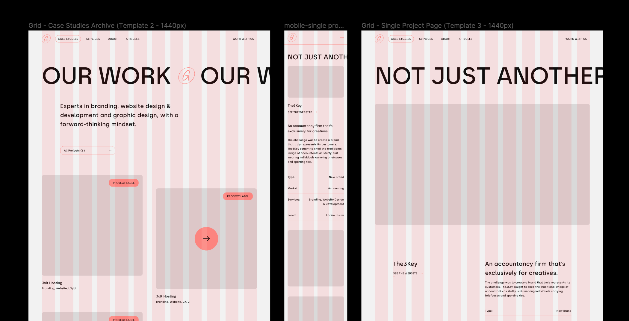
Grids play a crucial role in web design, providing a structured framework that helps designers organize and arrange content in a visually appealing and user-friendly manner. By dividing the layout into a series of horizontal and vertical lines, grids create individual sections known as grid cells. These cells act as containers where designers can place various elements, such as text, images, and interactive components.
One of the primary advantages of using grids in web design is the ability to achieve consistency and balance. By aligning elements to the grid lines, designers can ensure that each element is properly positioned and proportioned. This consistency not only enhances the visual appeal of the website but also improves the overall user experience.
Defining Grids in Web Design
In web design, a grid consists of a series of horizontal and vertical lines that form a framework. These lines create individual sections, known as grid cells, where designers can place content. Grids can be customized to fit the specific requirements of a website, allowing designers to organise elements.
When defining a grid, designers need to consider factors such as the overall layout, the type of content to be displayed, and the target audience. Depending on these factors, designers can choose between different grid systems, such as the popular 12-column grid or the flexible fluid grid. Each grid system offers its own set of advantages and can be adapted to suit the needs of the website.
Furthermore, grids can also be used to establish a visual hierarchy within the design. By assigning different grid cells to various elements, designers can create a sense of importance and guide the user’s attention. For example, important content can be placed in larger grid cells, while secondary information can be placed in smaller cells.
Different Types of Grids
There are various types of grids that designers can choose from, depending on the desired layout and content structure. Some common types include the single-column grid, the modular grid, and the hierarchical grid. Each type offers unique benefits and can be tailored to create a visually engaging and functional design.
The single-column grid is a simple and straightforward layout that consists of a single column of grid cells. This type of grid is commonly used for websites that focus on presenting content in a linear and easy-to-read format, such as blogs or news websites.
On the other hand, the modular grid allows designers to create a more dynamic and flexible layout. By dividing the grid into multiple modules, designers can arrange content in various configurations, creating a visually interesting design. This type of grid is often used for websites that require a creative and visually appealing presentation, such as portfolios or e-commerce websites.
The hierarchical grid, as the name suggests, is designed to establish a clear hierarchy within the layout. This type of grid uses different-sized grid cells to differentiate between primary, secondary, and tertiary content. By visually separating these elements, designers can guide the user’s attention and create a more structured and organized design.
Overall, the choice of grid type depends on the specific goals and requirements of the website. Designers should carefully consider the content, target audience, and desired visual impact to select the most suitable grid system.
Maintain Consistency
Consistency is key in web design, and grids play a crucial role in achieving this goal.
The Importance of Consistency
Consistency ensures that elements across different pages of a website are aligned, sized, and styled in a uniform manner. Grids provide designers with a framework to maintain this consistency, allowing for a cohesive visual experience that users will appreciate.
Tips for Maintaining Consistency
When working with grids, designers can follow a few tips to ensure consistency. Firstly, establish a baseline grid that determines the vertical rhythm of the website. This baseline grid helps align text, images, and other elements, creating a sense of order and harmony. Secondly, use a consistent set of horizontal and vertical spacing values to maintain uniformity between elements. Lastly, adhere to a consistent colour scheme, typography, and button styles to further reinforce the visual identity of the website.
Prioritise Responsiveness
With the increasing popularity of mobile devices, it is crucial to prioritize responsiveness when using grids in web design.
Understanding Responsiveness in Web Design
Responsiveness refers to the ability of a website to adapt and display properly across various devices and screen sizes. Grids enable designers to create responsive layouts that automatically adjust based on the available screen space. Prioritizing responsiveness ensures that users have a seamless experience regardless of the device they are using.
How to Achieve a Responsive Grid Design
Designers can achieve a responsive grid design by utilizing techniques such as flexible column widths, media queries, and designing for touchscreens. By embracing these techniques, grids can adapt to different screen sizes, providing an optimal viewing experience for users.
Balance is Key
Balance plays a crucial role in creating visually appealing and harmonious grid layouts.
The Concept of Balance in Grid Design
Balance refers to the equal distribution of visual elements within a layout. It ensures that no single element overwhelms the design and creates a sense of stability and order. Grids provide designers with a framework to achieve both symmetrical and asymmetrical balance, allowing for creative and visually pleasing compositions.
Achieving Balance in Your Grid Layout
To achieve balance, designers can utilize techniques such as the rule of thirds, the golden ratio, or the Fibonacci sequence. These techniques help distribute elements and create visually pleasing proportions. Additionally, designers should pay attention to the visual weight of elements and consider colour, size, and spacing to establish balance within the grid layout.
In conclusion, grids are an essential tool for web designers, helping them create visually pleasing, consistent, and user-friendly layouts. By following the five golden rules discussed in this article, designers can effectively utilize grids and enhance the overall web design experience. So remember, embracing grids in web design can lead to harmonious layouts and exceptional user experiences.